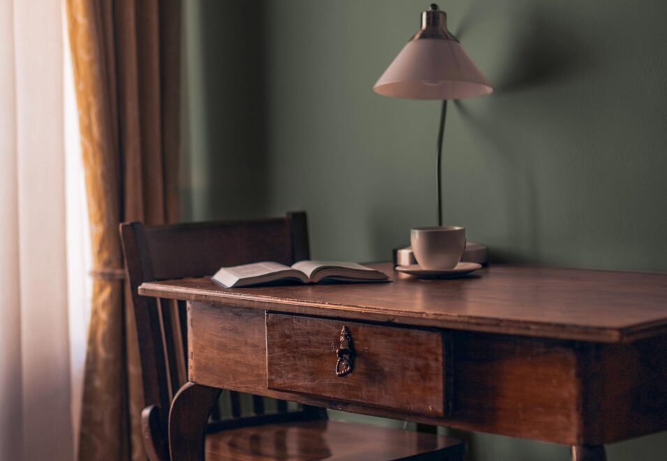
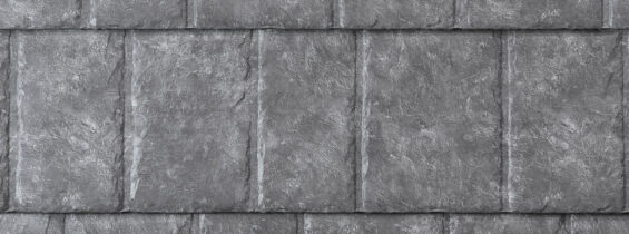
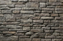
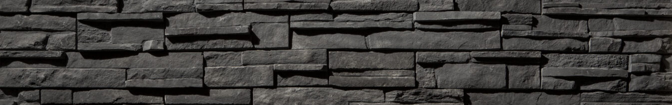
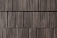
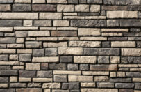
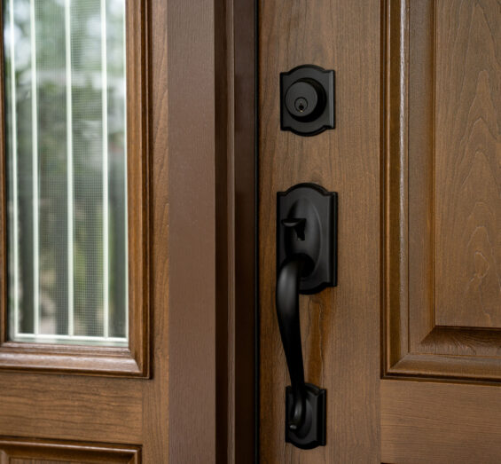
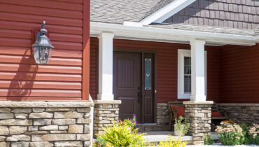
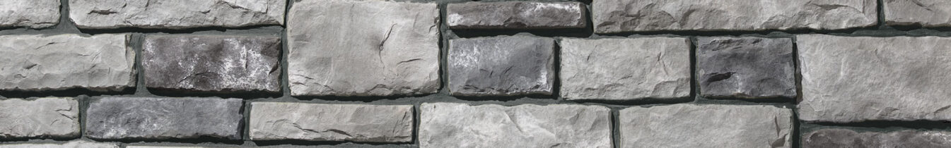
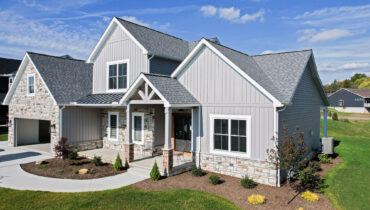
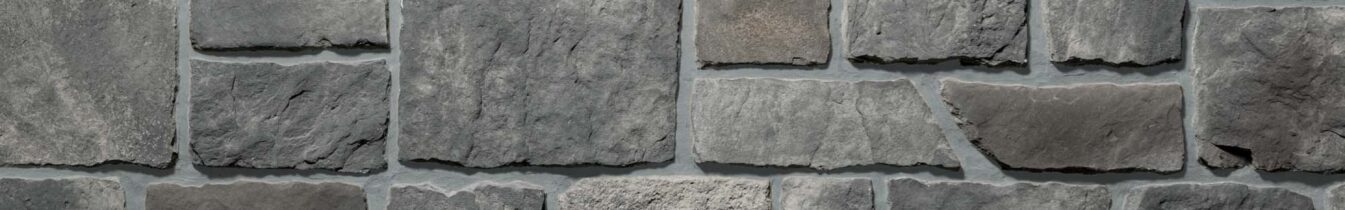
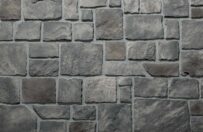
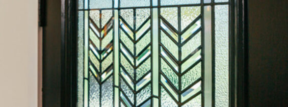
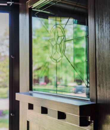
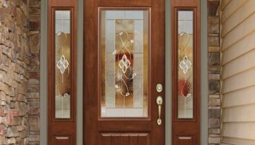
Palettes and Colors
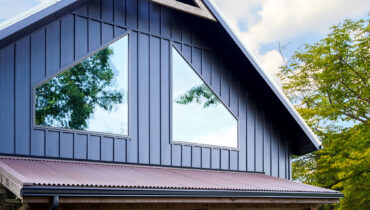
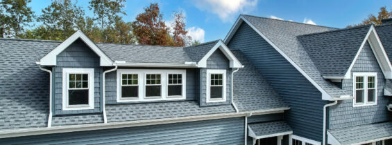
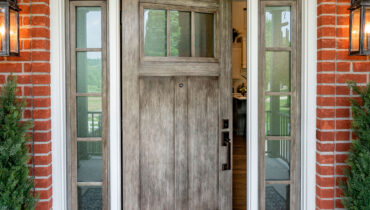
HOME EXTERIOR COLOR IDEAS
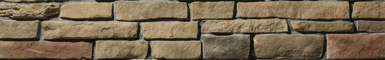
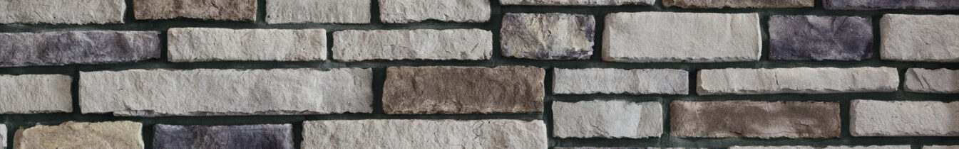
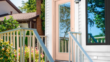
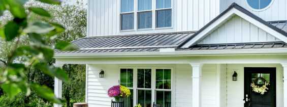
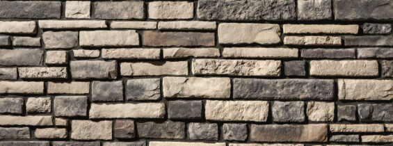
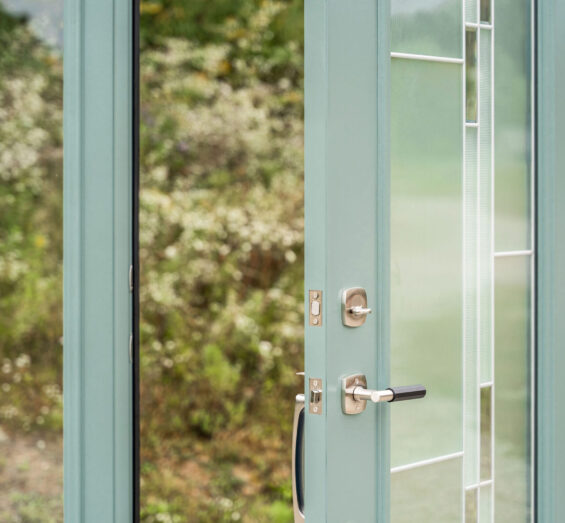
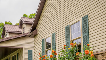
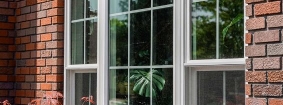
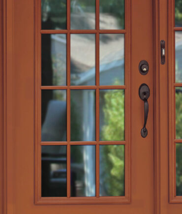
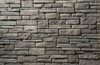
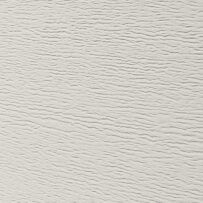
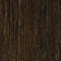
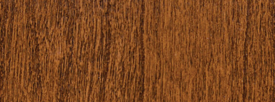
Choosing a complete home exterior color scheme? Our design team has carefully selected complete exterior color palettes that include door, window, siding, stone, and roofing colors.
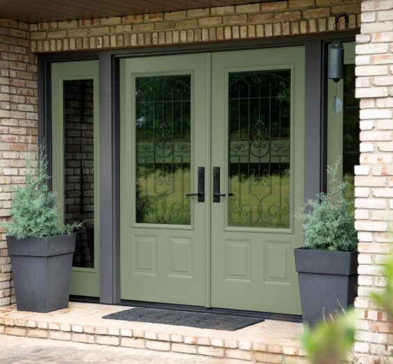
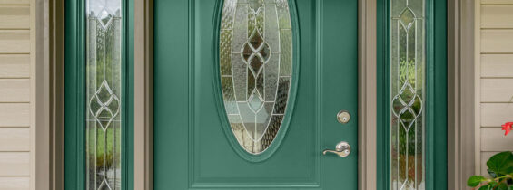
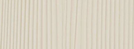
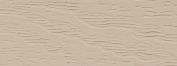
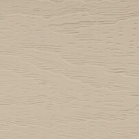
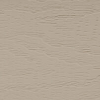
Antique
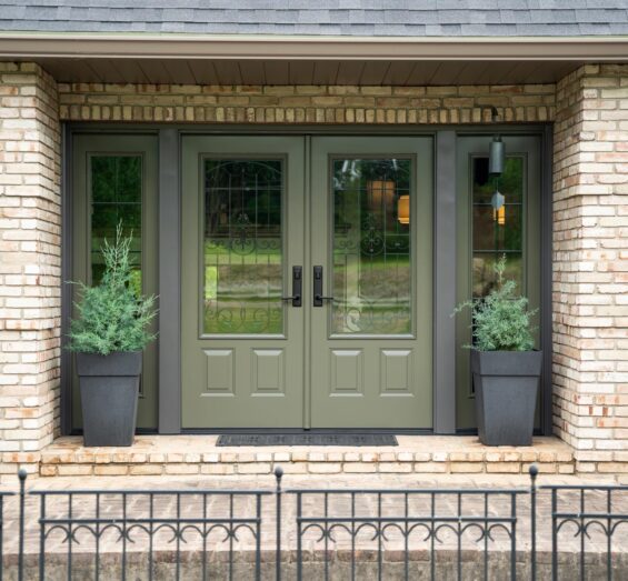
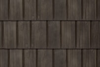
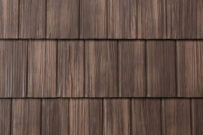
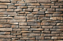
This harmonic home exterior color palette features an entry door with the name Antique, but the color combination provides the fresh, exciting feel of a new season. Antique White shake and shingle siding and Clay vinyl siding complement the olive-toned door, and Rustic Bronze windows, Bronzewood shake metal roofing, and Saginaw Ledgestone manufactured stone offer contrast.
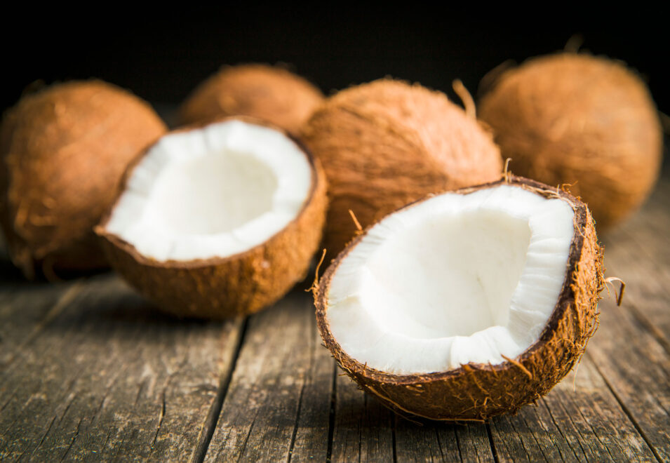
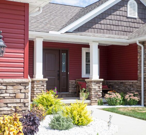
Toasted Coconut
The bold earth tones featured in this head-turning color palette warm the senses like the last rays of a vivid sunset on an unexpectedly warm spring day. Harvest Red vinyl siding and shake and shingle siding, Rustic Bronze windows, and Bronzewood shake metal roofing demand distinction among neighboring homes. Warm Santee Ledgestone manufactured stone unites reds and browns, while a soft Toasted Coconut door creates a focal point.
Pistachio
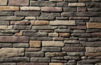
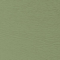
A soft green Pistachio entry door puts a chic spin on a classic color palette that pairs neutral colors such as light Prairie shake and shingle siding and White windows with dark Timberline vinyl siding and Ironstone slate metal roofing. Wellington Chisel Cut™ manufactured stone blends these neutrals with a hint of warm brown tones, creating a balanced, distinguished appearance.
Sea Green
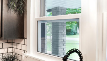
As refreshing as glistening emerald waters gently lapping powdery white sand, the Sea Green front door in this innovative exterior design palette is set apart from White windows. Southbriar Ledgestone manufactured stone adds a touch of warmth, and mid-toned Granite vinyl siding and Ironstone slate metal roofing deepen the palette’s curb appeal.
Daybreak
Like spring daffodils rising among grayish surroundings still waking from winter, a cheerful Daybreak entry door accompanies dark Sea Slate vinyl siding, Shadewood shake metal roofing, and White board and batten siding in this upbeat, yet polished palette. White vinyl windows and the blend of bright whites and dark grays in the Southport Dry Stack manufactured stone provide well-rounded contrast and a touch of glamour.
Blush
This home exterior color palette evokes a sense of surprising sophistication, showcasing a soft, rose-toned Blush front door and pristine White vinyl siding. Contrasting Coal Black windows, Onyx PrecisionFit™ manufactured stone, and Coalstone slate metal roofing give the palette an upscale flair that warmly welcomes guests and leaves an impression that is far from fleeting.
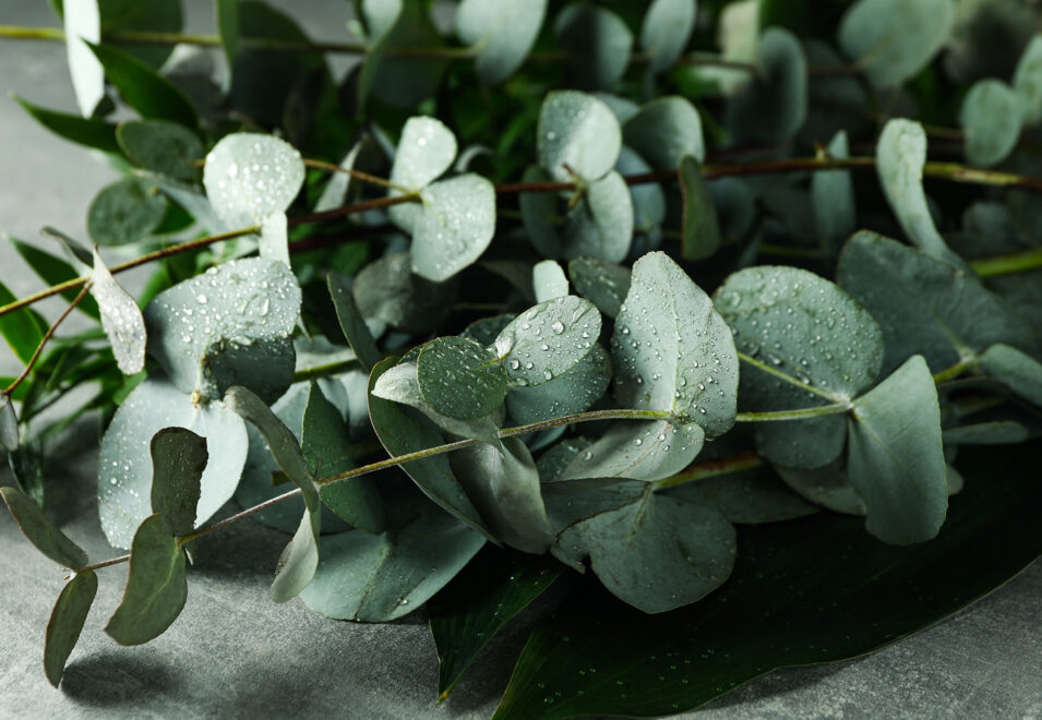
Eucalyptus
A Eucalyptus green front door takes center stage in this tranquil home exterior palette, contrasting strikingly against Antique White vinyl siding. Brindle Chisel Cut™ manufactured stone, Briarwood Shake metal roofing, and Canyon shake and shingle siding bring depth, while white vinyl windows add softness and balance in this palette that feels rejuvenating every time you return home.
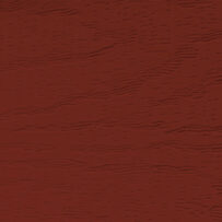
Natural Bark
As comforting and familiar as the aroma of cinnamon and apples baking in a holiday pie, vinyl siding in Harvest Red provides a warm welcome, while the brown tones in the Natural Bark front door, Canyon shake and shingle siding, Shawnee Dry Stack manufactured stone, and Lodgestone slate metal roofing add richness. Creamy Sandstone windows stand out against the darker tones of this palette.
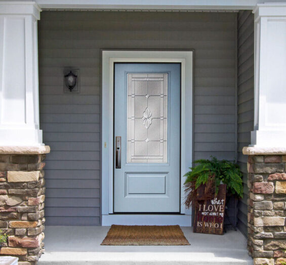
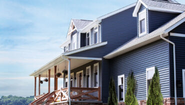
Arctic Blue
Reminiscent of a fresh snowfall in the quiet, early hours of a winter morning, this cool color palette combines a calming balance of light and dark tones. An icy Arctic Blue entry door, Gray shake and shingle siding, and bright White windows contrast boldly against steely Baystone slate metal roofing and deep blue Neptune vinyl siding. Mystic Ledgestone manufactured stone blends bright gray highlights with deep gray shadows.
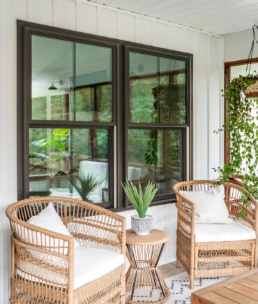
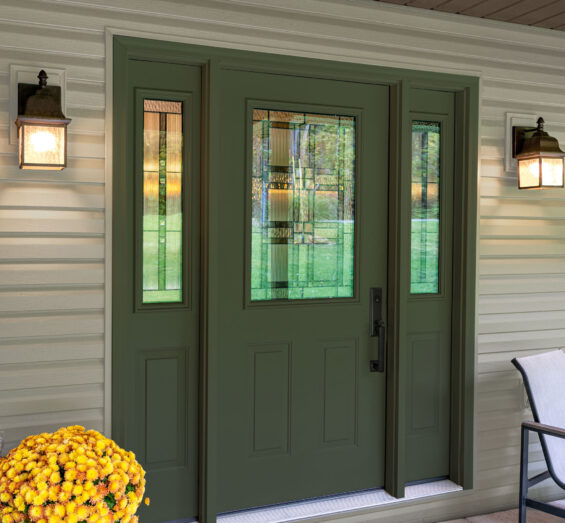
Evergreen
Robust, yet down to earth, this exterior color palette has the invigorating feel of a hike through an aromatic evergreen forest on a crisp December morning. Showcasing a striking Evergreen door and bold Boston Thin Brick manufactured stone, this color scheme gains balance with a blend of brown tones in the Clay vinyl siding, Rustic Bronze windows, Bronzewood shake metal roofing, and Timberline shake and shingle siding.
Rainfall
Sometimes the best home exterior color ideas are the most classic and versatile. In this exterior color palette, the contrast of crisp black and white, such as white vinyl siding, Coal black shake and shingle siding, and Coal Black vinyl windows, harmonize with a cool Rainfall blue front door. Harbor Limestone manufactured stone and Shadewood shake metal roofing provide the various tones of gray in this chic palette that will remain on trend for years to come.
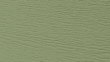
Truffle
A new season is sometimes all it takes to start seeing things with a fresh perspective, and spring has a way of doing just that. Inspired by spring’s rejuvenating effect, this exterior house color scheme marries sprightly Sage green vinyl siding with earthy browns such as Saddlewood shake metal roofing and a rich Truffle stained front door. Sandalwood shake and shingle siding and white vinyl windows complement the darker hues for a fresh palette that feels new every time you see it.
Deep Waters
Calming blue hues are timeless colors for house exteriors, offering a sense of tranquility. In this captivating home exterior color palette, a Deep Waters front door color contrasts against a backdrop of warm Pueblo vinyl siding and creamy Antique White shake and shingle siding, while Shadewood shake metal roofing and Seaboard Natural Cut™ manufactured stone unify cools and warms. Rustic Bronze vinyl windows add further richness and depth.
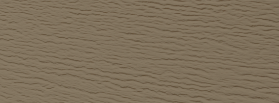
Natural Leather
Reminiscent of warm, sandy shores and cozy knitted blankets, the soft neutral Antique White vinyl siding, Clay shake and shingle siding, and light Rainier Terra Cut™ manufactured stone in this home exterior color palette feel inviting and comforting. Saddlewood shake metal roofing and Rustic Bronze painted windows deepen the palette, while a Natural Leather glazed front door provides charm and character.
Burnt Sienna
A warm, welcoming Burnt Sienna painted entry door is the perfect complement to soft Linen shake and shingle siding and Sandalwood vinyl siding in this glowing home exterior color palette. Earth tones such as Briarwood shake metal roofing and Yosemite Ridge Cut™ manufactured stone bring depth to the vibrant Burnt Sienna, creating a palette that continues to sizzle long after the last brilliant leaf of autumn falls to the ground.
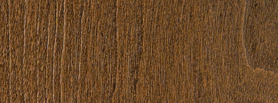
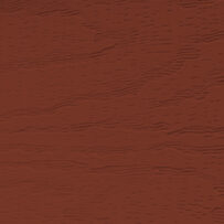
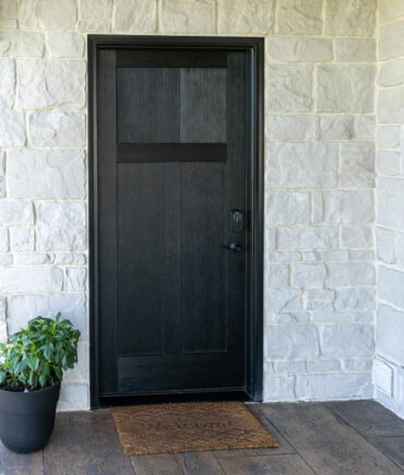
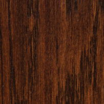
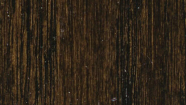
Espresso
Bold first impressions have an unforgettable impact. Full of confidence and character, this color palette showcases striking Mountain Berry red vinyl siding and a dark Espresso stained front door with steely Shadewood shake metal roofing. Whisperwood Dry Stack manufactured stone blends grays and browns, while Linen board and batten and white windows offer crisp, refreshing contrast for a bold home exterior color palette that will not soon be forgotten.
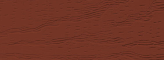
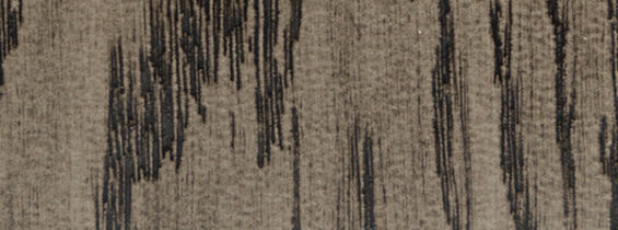
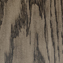
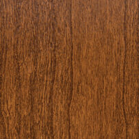
American Cherry
The timeless look of classic woodgrain gets a warm, spicy flair with an American Cherry stained front door, while Shadewood shake metal roofing brings balance to the warmth. Denali Ridge Cut™ manufactured stone and Prairie vinyl siding unite warm and cool tones for an earthy blend that feels as comforting as the smell of apples and cinnamon wafting through the air on a fall day. Pure white vinyl windows add a refreshing dollop of contrast to the mix.